
HEY FRIENDS! I haven’t been coloring much lately, but I have been watching a lot of coloring videos and Amy Shulke’s YouTube channel has been heavily in my video rotation. She takes coloring up several notches into the realm of realistic coloring by underpainting with Copic markers. Check out her blog and the archive of free resources that she offers.
Amy’s uses underpainting along with colored pencils to achieve remarkable realism in her coloring. I’ve long been interested in the technique of underpainting – applying a layer of color as a base to help define the value of subsequent layers of color. As you know, Copic makes lots of pretty, bright colors, but falls short on the murky colors that create depth and realism. It doesn’t help that Copic classes often teach you to use the darkest value of a given color in the shadowed areas and then calls it coloring with depth and dimension. As Amy would tell you, the shadow of a color is not a darker shade of the same color. It’s a murky, muddy color that Copic probably doesn’t make. That’s where underpainting comes in.
And if you don’t believe me – take a look at this article by Amy where she explains the need for ugly marker colors and how to create the colors that Copic doesn’t make. Be sure to take a good look at the two versions of the image by CC Design. We were all taught in traditional Copic classes to create some version of the first version, but look at the difference in the result when you add underpainting to your coloring.
Now Amy tends to color lots of truly realistic images — check out her cinnamon roll image — and she uses photo references for color selection. I used to color a lot of floral images in my Power Poppy days, but lately thanks to my current design team participation, I’ve been coloring a lot of cute images that are a very different style. But I believe in taking a technique I’ve learned in one situation and incorporating it into what I do elsewhere. So that brings us to today’s project.
Today’s Project
Today I’m coloring a guinea pig contemplating a paint brush. The realism train left the station long before I picked up a marker. And to be honest, I don’t want to make the coloring hyper-realistic because it would be out of character for the image, BUT I can still apply the concept of underpainting and colored pencils to enhance the end result.

Featured Products
COPICS: Number in bold italics indicates marker used as underpaint.
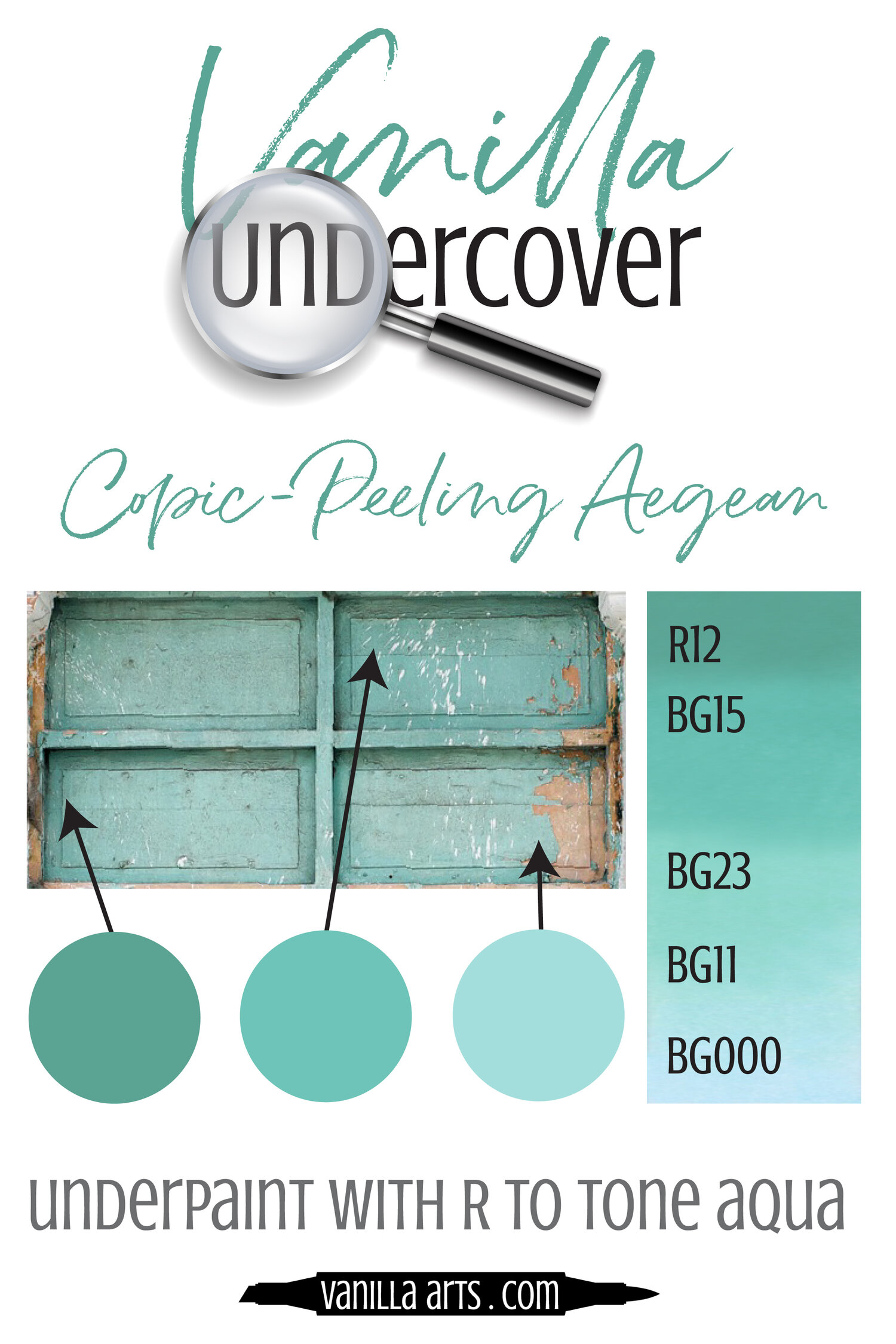
YR21, YR23, YR24, B21 (guinea pig); E00, E04 (foot); T3, T5, T7, T9 (handle); C0, C5 (furrell); R12, BG000, BG11, BG23, BG15 (bristles and paint); BV31, R20, R21 (label); BV31, BV34 (shadows)

[Compensated affiliate links used when possible. In addition, as an Amazon Associate I earn from qualifying purchases. Items marked with an asterisk (*) were provided by a store or the manufacturer. All other items were personally purchased.]


Intense Black Ink | Hero Arts
[ SBC ]

Bristol Smooth 300 Series | Strathmore
[ BLICK ]

Copic Markers
[ BLICK ]

Prismacolor Colored Pencil PC938 – White
[ BLICK ]

Prismacolor Colored Pencil PC1026 – Greyed Lavendar
[ BLICK ]

Nesting Rectangle Infinity Dies | Hero Arts
[ SBC ]
Underpainting with Copics
First of all, I should also note that I have switched to Strathmore Bristol Smooth for my Copic coloring because it is smooth enough for Copic ink but has enough tooth for colored pencil. My supply of Hammermill is weeping, but I’ll use it for other projects.
I still need help picking colors for underpainting so I rely on Amy’s Underpaint Swatches. Here are the three that I used for today’s project.
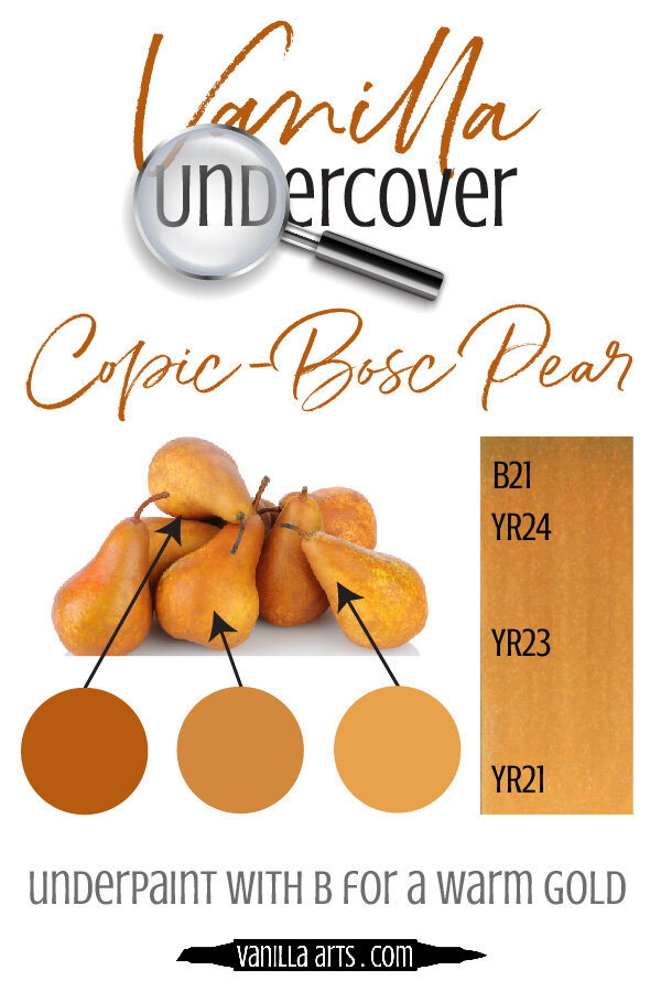

I was attracted to the first color combination because I could achieve a realistic brown without using a single E marker. Not that I have anything against the E markers, but the browns can sometimes look a little flat. Here my Guinea pig has a golden glow that feels more realistic.
Once the Copic coloring was completed, I used Primacolor pencils in PC 1026 (Grayed Lavendar) to deepen the underpainted areas and PC938 (White) to add a highlight on the barrel and furrell of the paintbrush.

Hope you enjoyed today’s project. Be sure to check out Amy’s blog, YouTube channel, and classes!

You have such a great ability for coloring images! Your shading is perfect and your stamped images come to life! This card is so precious!
Thanks Lori! ❤️
I adore Anita Jeram images and your coloring with them is like a match made in heaven! GREAT card!! Love the colors you selected!!
Lori S in PA
Thanks Lori! 😘